Goblin Manor, my goblin bureaucracy adventure now has jaunty isometric maps! If you haven't already, you can pick it up here.
When I initially envisioned Goblin Manor, it was going to be
a pointcrawl through an endless palace, with procedurally generated encounters
between major nodes. For better or
worse, I got seduced by a map of the Biltmore Manor, and that became the
template for the first journey through.

When I decided to put the adventure out there, the goal was always some kind of isometric map; they convey tons of information and I have found them unaccountably captivating ever since Bil Keane's Family Circus and Martin Hanford's Where's Waldo.

Some of the more immediate inspiration/aspiration includes the maps from the Brambly Hedge series by Jill Barklem:

Luka Rejec's luscious maps (if you don't have his UVG yet, stop and fix that now):
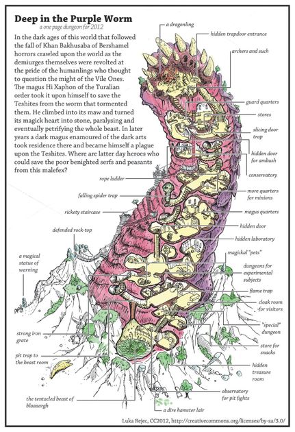
and Jason Thompson's amazing module summaries:

The hardest decision was the scale, the temptation was to simply draw everything, and while there's a certain beauty there I would never finish (I lack Jonathan Newell's focus and work ethic). Once I figured out the right level of detail things fell into place. There was a lot of information to convey, so I settled on a scheme where any inhabitants were coded red, and the walls and floors were light grey. This made things a lot more comprehensible, and made what's going on in each room a lot clearer.

I broke the larger maps into smaller, contextual maps that would allow you to have the information close at hand as you read the module. In most cases each area is broken up into a two-page spread with a minimap, putting everything right in front of you as you read. A lot of adventures focused on usability have adopted this strategy.

Just as an experiment I started coloring in one of the maps, and it became clear this could be a next step. Here's me tinkering:


How many floors is there in this manor?
ReplyDeleteFour and a half, with almost exactly 100 rooms altogether.
Delete